Read wall clock from a distance: size and placement tips
Essential to remember : Reading a wall clock clearly from across the room requires matching the clock diameter to your viewing distance while ensuring high contrast between hands and dial. For most living spaces, a 12-to-18-inch diameter provides optimal legibility without overwhelming the room's proportions. The key is finding the right balance between functionality and decor-oversized clocks can feel aggressive in smaller spaces, while undersized ones force you to squint.
Optimal legibility depends on matching the clock diameter to the viewing distance while prioritizing high contrast between hands and the dial. This balance ensures instant readability without visual clutter or eye strain. For most standard living areas, a 12-to-18-inch diameter typically provides the ideal combination of function and proportion.
Struggling to read wall clock distance clearly from across the room often turns a quick time-check into a frustrating moment of squinting and guesswork. We analyze the ideal diameter-to-distance ratios and high-contrast design features that allow your brain to process the time instantly, regardless of your room's specific layout or lighting. Discover the expert sizing rules that guarantee absolute legibility, ensuring your clock serves as both a precise functional tool and a stunning visual anchor.
- The Size Factor: Matching Your Clock to Your Room
- Beyond Size: The Critical Role of Contrast and Clarity
- Strategic Placement for a Perfect View
- Decoding the Dial From a Distance
- When Analog Isn't Enough: Modern Solutions and Special Cases
The Size Factor: Matching Your Clock to Your Room

Why "Bigger Isn't Always Better"
Grabbing the largest face available is often a mistake. An oversized clock in a small room feels aggressive and ruins the decor balance. You want proportion, not just brute size.
Your choice really hinges on the specific viewing distance: is this a functional tool or a decorative centerpiece?
The right diameter creates harmony, making the time check natural rather than a forced squint.
A Practical Guide to Clock Diameters
For compact spots like a home office, 10 to 18 inches (25-46 cm) model works best. It fits without suffocating the wall.
In standard living rooms, aim for 18 to 24 inches (45-60 cm). This range lets you read wall clock distance clearly without dominating the space.
Got high ceilings? Go bold. Anything over 24 inches (60 cm+) acts as a statement piece while remaining legible from afar.

The Distance-to-Size Rule of Thumb
There is no perfect formula, just design principles. Legibility boils down to a simple ratio between where you stand and the face size.
Use this chart as a practical guide to map out your needs. It's a handy tool, not a rigid law.
| Viewing Distance (from your couch, desk, etc.) | Minimum Recommended Clock Diameter |
| Up to 10 feet (approx. 3 meters) | 10-14 inches (25-35 cm) |
| 10 to 15 feet (approx. 3-4.5 meters) | 14-18 inches (35-45 cm) |
| 15 to 20 feet (approx. 4.5-6 meters) | 18-24 inches (45-60 cm) |
| Over 20 feet (approx. 6+ meters) | 24+ inches (60+ cm) |
| This is a guideline. Factors like numeral size and contrast also play a huge part. |
Beyond Size: The Critical Role of Contrast and Clarity
Okay, you've nailed the size. But a massive clock that's unreadable is just wall clutter. The real secret to read wall clock distance effectively isn't just dimensions; it's the face design itself.
The Power of High Contrast
Your eyes rely on hard edges to decipher shapes instantly. For a clock, this is non-negotiable. The classic combo of black numbers on a white background isn't a cliché for nothing. It maximizes clarity.
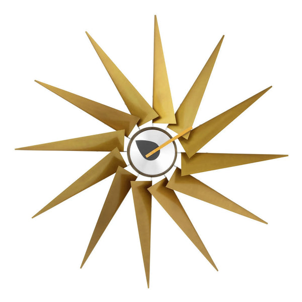
Beware of "designer" faces using tone-on-tone colors or textured backgrounds. They might look sleek up close. But step back, and they become a frustrating visual fog.
This contrast rule applies equally to the hands. They must pop against the face.

Numeral Style Matters More Than You Think
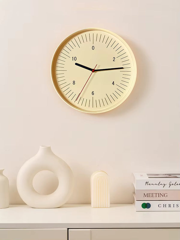
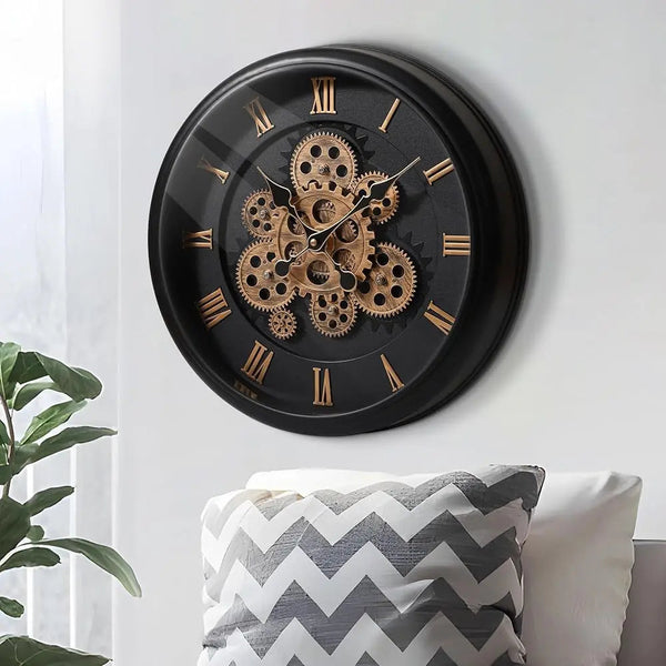
Let's compare your options. Roman numerals might look elegant, but they are complex to decipher quickly from afar. A "IV" easily blurs into a "VI".
For maximal legibility, nothing beats bold, simple Arabic numerals (1, 2, 3...). Their shape is universally and instantly recognizable. Minimalist clocks with just markers are the absolute worst for precise reading at a distance.
Font choice counts too. Avoid thin or overly stylized scripts. Think "bold and simple".
Hand Design: Don't Overlook the Details
Most people forget the hands until it's too late. If you can't distinguish the hour hand from the minute hand in a blink, the clock fails. The difference in length and thickness must be obvious and marked.
You need distinct shapes to avoid guessing games. Here is exactly what separates a functional tool from a wall decoration:
- Clock Hand Design: What to Look For
- Good: Hour hand is short AND thick. Minute hand is long and visibly thinner.
- Bad: Both hands are similarly thin, ornate, or short.
- Good: Simple, straight hands (like "stick" or "spade" styles).
- Bad: Intricate, decorative hands (like "cathedral" styles) that become a blur from afar.
Strategic Placement for a Perfect View
Now that you have secured the perfect timepiece, don't ruin the setup by hanging it in a blind spot. Honestly, where you put it matters just as much as the design itself.
Finding the Right Height
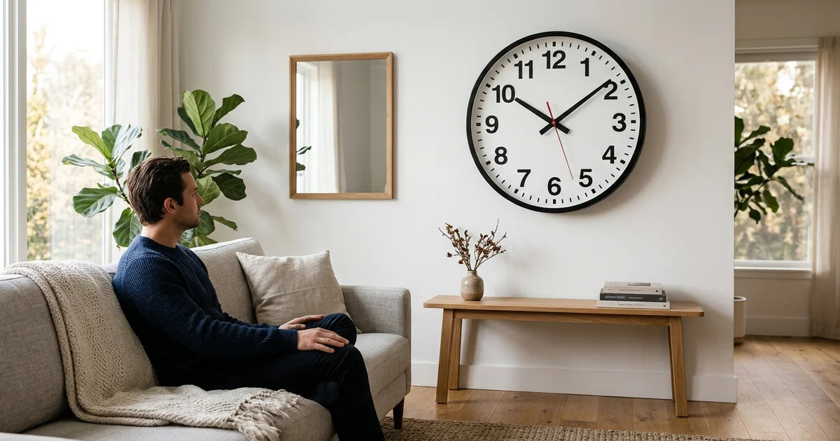
Steal a simple trick from art galleries that applies perfectly here. You need to hang the clock at eye level. The center of the dial should sit roughly 57 to 63 inches (145-160 cm) off the floor.
However, if you are mounting it above a piece of furniture like a sofa or buffet, the rules shift. You must leave a gap of 8 to 10 inches (20-25 cm) between the furniture top and the clock bottom so the arrangement breathes.
The goal is to avoid craning your neck. The glance should feel completely natural.

Beating Glare and Reflections
Glare is the silent killer of legibility. A glass-faced clock placed directly opposite a sunny window becomes practically useless during the day. You have to anticipate the light's trajectory before hammering a nail.
The same problem happens with artificial lighting. Never mount your timepiece directly underneath a harsh spotlight.
The test is simple: check the chosen wall at different times of the day. If you see a reflection, pick another spot.
Viewing Angles from Your Key Spots
A kitchen clock must be visible from the prep counter. In the living room, check from the sofa; in the office, from your desk. It sounds obvious, yet many ignore the read wall clock distance factor.
Before drilling any holes, run a simulation. Hold the clock against the wall and sit in your usual spots.
Your line of sight needs to be direct and unobstructed. No twisting or contorting required to simply check the time.
Decoding the Dial From a Distance
Even with the best clock and optimal placement, reading time from afar takes a specific mental shift. Here is how your brain can decipher the time in a split second.
The Basics Revisited: Hour vs. Minute Hand
Let's get back to basics. The hour hand is your anchor, it is the short, sluggish one. It gives you the general timeframe immediately. Always locate this stubby pointer first to orient yourself before worrying about the details.
The minute hand is the long one reaching for the edge. It provides the precision. While they might look similar from twenty feet away, their relative length is the only thing that matters. Ignore the speed; focus on the reach.
Using Quarter-Hour Markers as Your Guide
Stop trying to see the individual minute ticks. It is a waste of energy. To read wall clock distance effectively, you just need to spot the clock's four cardinal points.
The 12 (top), 3 (right), 6 (bottom), and 9 (left) are your visual anchors. Seeing where the minute hand lands relative to these spots gives you an instant estimate, quarter past, half past, or quarter to.
This method of visual estimation is infinitely faster than squinting at tiny graduations.
Common Reading Mistakes and How to Avoid Them
We all mess this up, especially during a quick glance. The most frequent blunder is simply swapping the hands in your mind because you didn't check the length.
Here is a breakdown of where things usually go wrong:
- The 6:30 vs 12:30 mix-up: When hands are aligned vertically, check the short hour hand. Is it near the 6 or the 12?
- The "almost hour" confusion: At 5:50, the hour hand is very close to 6. Always read the minute hand first to confirm if the hour has passed.
- Mirroring hands (e.g., 8:20): When hands are symmetrical, focus on the length. The longer one dictates the minutes.
When Analog Isn't Enough: Modern Solutions and Special Cases
What if, despite all this advice, an analog clock just isn't the right fit for you? Sometimes, you have to look elsewhere.
The Case for Digital Wall Clocks
Let's be honest: for raw, unambiguous legibility, nothing beats a large digital display. No hands to interpret, no Roman numerals to decipher. Just the time, in clear numbers.
They are particularly useful in environments where precision is key, like workshops, or for anyone trying to read wall clock distance effectively. The style is different, sure. But the function is often superior.
Considerations for Specific Needs
Needs aren't universal. For senior users, the absolute priority is a massive display, maximum contrast, and potentially a backlight for night viewing.
For kids just learning to tell time, a colorful clock with clearly marked minutes can be much more useful.
Clock Features for Enhanced Accessibility
- For seniors: Look for large (14"+) diameters, bold Arabic numerals, and high-contrast faces. Backlit options are a major plus.
- For kids' rooms: Consider larger sizes (47"+) for easy learning, with clear hour and minute markers.
- For focus-sensitive individuals (e.g., with ADHD): A simple, uncluttered analog face or a clear digital display can reduce cognitive load and distraction.
The "Silent" Factor: Don't Forget Your Ears
Legibility isn't just visual. The constant "tick-tock" of a clock can be incredibly distracting, especially in a quiet bedroom or office. It is a form of auditory pollution.
If silence is golden for you, look for clocks with a continuous sweep movement. The hands glide without jerks and without noise, preserving the tranquility of your space.
Ultimately, the best wall clock balances style with strict functionality. Prioritize the right diameter for your room size, insist on high-contrast visuals, and mount it at eye level. With these elements aligned, your timepiece becomes a functional focal point, ensuring you can always read the time effortlessly from across the room.
