Why Clocks Show 10:10: The Marketing Tradition
Clocks set to 10:10 are a strategic marketing choice for visual harmony and psychological impact. The hands form a 'smile', enhancing brand appeal. A 2017 study confirmed this setting significantly boosts purchase intent. This standard ensures logos and complications remain visible, with its influence now extending to AI-generated images.
Why clocks 10:10? This isn't a random quirk or historical myth—it's a deliberate and strategic design choice deeply rooted in marketing psychology. The symmetrical arrangement of the clock hands at 10:10 ensures optimal visual balance, perfectly framing the brand logo beneath the 12 o'clock mark while keeping all essential complications like date displays and chronograph subdials fully visible. Research confirms this configuration activates pareidolia, triggering subconscious positive emotions that enhance brand perception and increase consumer desire. Even AI models replicate this convention due to its dominance in imagery. Luxury brands like Rolex and Omega use it to enhance brand perception and emotional connection.
- The Golden Rule of Visual Harmony and Branding
- A Modern Twist: Why AI Is Also Stuck at 10:10
- The exceptions that prove the rule: not everyone is at 10:10
- A tradition perfectly set in time
Why you almost always see clocks set to 10:10

Have you ever wondered why clocks in advertisements consistently display 10:10? Whether it's a luxury Rolex or a simple wall clock, this time appears everywhere. It's not accidental. This positioning is a deliberate marketing strategy designed for visual harmony.
The hands at 10:10 create a symmetrical 'smile' shape, framing the brand logo perfectly. This avoids hand overlap and ensures all dial elements, like date windows or chronograph subdials, remain visible. Many myths claim connections to historical events, but these are untrue. For example, Abraham Lincoln died at 7:22 AM and John F. Kennedy at 1:00 PM.
Studies show this configuration triggers subconscious positive emotions, making the watch more attractive to potential buyers. Brands like Rolex often set their watches to 10:10:31, while Apple Watch defaults to 10:09. Some adjust slightly to highlight specific features. Though not universal, this practice is widespread in advertising. The ultimate goal: to present a product that looks appealing, positive, and professional.
The Golden Rule of Visual Harmony and Branding
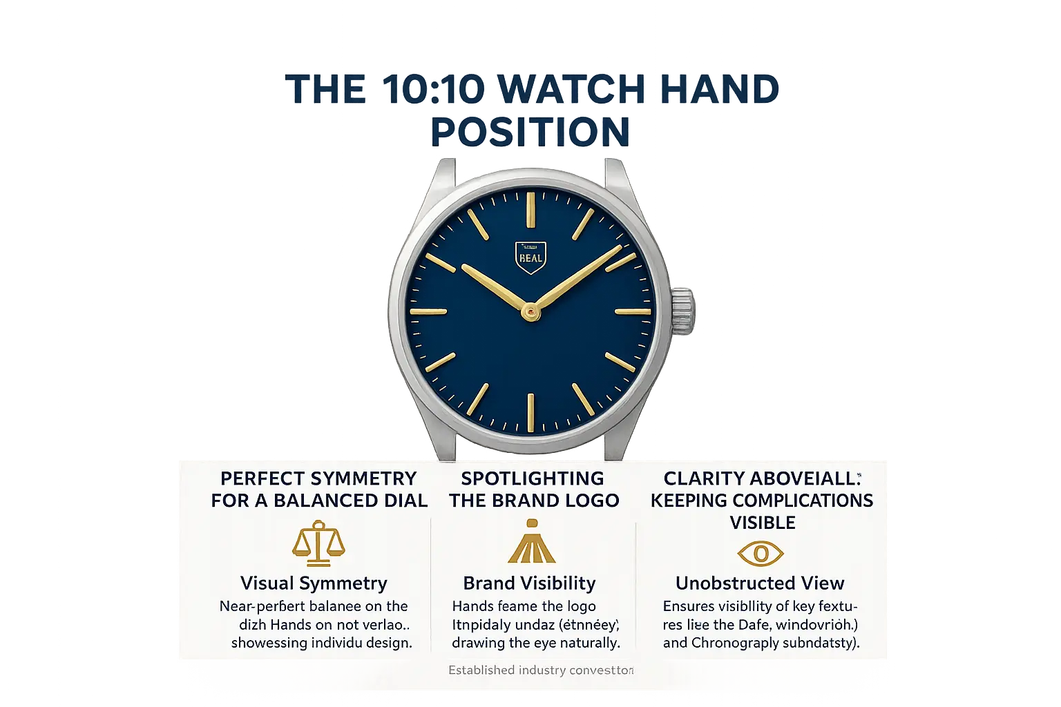
Perfect Symmetry for a Balanced Dial
At 10:10, watch hands form a perfect symmetrical 'V'. This arrangement prevents overlapping and showcases the design clearly. Unlike 8:20 (which looks like a frown), it creates a positive appearance.
Many observers perceive the 10:10 position as a smile, triggering positive subconscious associations. This psychological effect enhances brand perception significantly. This positioning is so effective that automatic watch winders often default to 10:10 to maintain this ideal look.
Spotlighting the Brand Logo
Brands like Rolex often set time to 10:10:31 for precise symmetry. Omega and Seiko use similar positions. The hands frame the logo below 12, making it the focal point. Rolex's 10:10:31 setting includes the second hand for perfect balance. This subtle branding technique emphasizes prestige without distraction.
It's a standard in advertising but not universal, as some adjust for unique designs. This strategic placement ensures the logo remains the visual centerpiece of every advertisement.
Clarity Above All: Keeping Complications Visible
Complications like date windows at 3 o'clock stay fully visible. Chronograph subdials at 3, 6, and 9 hours remain unobstructed. Power reserve indicators and moon phase displays also stay clear. For example, Nomos Glashütte uses 11:12 to highlight its power reserve.
- Date windows typically at 3 o'clock
- Chronograph subdials at 3, 6, and 9 positions
- Power reserve indicators and moon phase complications
This 10:10 convention is a well-established marketing tradition, not a technical requirement. As detailed in Medium's horology analysis, it's purely for visual harmony. Some brands like Apple Watch use 10:09, but the principle remains the same.
The Psychology of the Smiling Watch: How 10:10 Influences Your Brain
From a 'Frowning' Face to a 'Smiling' One
Before the 1950s, brands like Timex used 8:20. This position created a frowning face as hands pointed downward. Marketers realized this looked negative. Switching to 10:10 formed a smile, improving brand appeal. It's a strategic aesthetic choice, not a technical rule.
At 10:10, the hour and minute hands frame the logo symmetrically. They don't overlap, ensuring clear visibility of the brand name and other details. This positioning is intentional for better product presentation in ads and catalogs.
For instance, Timex updated its display from 8:20 to 10:09:36 for a positive expression. Luxury brands like Rolex have used variations such as 10:17, but 10:10 became the standard for visual harmony. Many others follow this tradition to create a friendly, approachable image.
Pareidolia: The Science of Seeing Faces in Objects
Pareidolia is the brain's tendency to see patterns, like faces, in random objects. The 10:10 clock position activates this phenomenon. The hands form a smile, triggering subconscious positive emotions toward the watch.
This psychological effect occurs automatically, even without conscious awareness. Humans are wired to recognize faces quickly, making 10:10 an effective marketing tool for creating favorable impressions.
Examples of pareidolia include seeing faces in clouds or the moon. In watch advertising, this natural perception enhances brand connection and emotional appeal. It's a powerful subconscious influence on consumer decisions.
The Scientific Proof of a Positive Impact
A 2017 study published in Frontiers in Psychology confirmed this effect. Participants rated 10:10 as more pleasant and expressed higher purchase intent.
The research showed women responded more strongly to the 10:10 position. This aligns with studies on facial recognition sensitivity. However, not all brands use this standard.
Apple Watch displays 10:09, Casio G-Shock shows 10:58:50. Some brands choose different times for design reasons. It's a marketing tradition, not universal. For example, Nomos Glashütte uses 11:12 to frame their reserve indicator.
Debunking the myths surrounding the 10:10 tradition
Many myths claim the 10:10 clock position has historical or technical roots, but all are completely unfounded.
- Historical figures' deaths: Abraham Lincoln died at 7:22 AM, JFK at 1:00 PM, and MLK Jr. at 7:05 PM — none occurred at 10:10.
- Atomic bombings: Hiroshima bomb detonated at 8:16 AM on August 6, 1945; Nagasaki's at 11:02 AM on August 9 — neither was at 10:10.
- Inventor's legacy: No single inventor created modern clocks; timekeeping evolved through centuries of innovations.
- "V" for victory: The "V" symbol was popularized in 1941 by Belgian minister Victor de Laveleye for BBC broadcasts as a resistance symbol against Nazi occupation — medieval battle myths have no historical basis.
These stories are popular but lack evidence. The true reason is purely aesthetic.
At 10:10, the hands frame the brand logo symmetrically, creating a "smile" and ensuring all dial elements are clearly visible.
Timex changed from 8:20 (which looked like a frown) to 10:09:36 for a more positive expression — a deliberate marketing choice, not technical necessity.
Brands like Hublot and Omega use 10:08, Apple Watch shows 10:09, and Nomos Glashütte displays 11:12 — all for visual harmony in advertisements.
This tradition is common in marketing but not universal. Brands adjust times to highlight specific features, yet the core principle remains aesthetics over historical facts.
The exceptions that prove the rule: not everyone is at 10:10
Setting clock hands to 10:10 is a marketing tradition for visual symmetry and logo framing. It avoids overlapping hands, ensuring clarity and a 'smiling' appearance. Historically, many clocks used 8:20 (frowning), but Timex switched to 10:09:36 in the 1950s for a friendlier look. Rolex's 1927 ad used 10:17, but modern brands now prefer 10:10. The symmetrical positioning creates a balanced composition that is visually appealing, making it the go-to choice for catalogs and advertisements. This position also keeps complications like date displays visible. However, brands sometimes deviate for specific reasons. Seiko uses 10:08:42 for dynamism, Casio's G-Shock shows 10:58:50 for rugged digital features, Apple Watch's 10:09 honors tradition, Parmigiani sets 07:08 for the founder's birth time, and Oris chooses 7:53 to frame its logo. These choices reflect marketing strategies, not technical needs.
| Brand | Time | Reason |
| Seiko | 10:08:42 | Dynamism & visibility |
| Timex | 10:09:36 | Replaced 8:20 for 'smile' |
| Casio G-Shock (digital) | 10:58:50 | Rugged digital features |
| Apple Watch | 10:09 | Honors mechanical tradition |
| Parmigiani Fleurier | 07:08 | Founder's birth time |
| Oris | 7:53 | Frames logo distinctly |
Each brand's time selection reflects its identity. Seiko's 10:08:42 positions hands to frame the logo while keeping chronograph elements visible. Casio's 10:58:50 ensures digital digits are fully displayed. Apple's 10:09 balances tradition and innovation. Parmigiani's 07:08 and Oris' 7:53 tell deeper stories through craftsmanship. A well-framed clock face evokes positive emotions, making products appear premium and reliable. These strategic adjustments enhance brand perception and drive consumer trust and sales success.
A Modern Twist: Why AI Is Also Stuck at 10:10
Ever wonder why AI tools like DALL-E and Midjourney always draw watches at 10:10? It's not a coincidence. These models learn from billions of online images where watch ads overwhelmingly use this time.
Marketing teams have long preferred 10:10 for its visual symmetry. The hands form a 'smile', framing the brand logo without obscuring complications. This marketing tradition, dating back decades, became the default in product photography.
As un phénomène observé dans les modèles d'IA générative, AI simply replicates this pattern. It lacks context to understand why 10:10 is used—it just follows the data it was trained on.
This reveals a key AI limitation: it mirrors human biases without critical thought. When data is skewed, AI perpetuates it. The next time you see a virtual watch at 10:10, remember—it’s a reflection of our marketing choices, not a technical rule.
A tradition perfectly set in time
Why do watch advertisements always show 10:10? It's a deliberate marketing strategy, not a technical requirement. Brands like Rolex position the hands to create visual harmony. The symmetrical arrangement frames the logo neatly, forming a subtle 'smile' that evokes positivity.
At 10:10, the hour and minute hands don't overlap, ensuring clear visibility of all dial elements. This design choice enhances product appeal. Timex even changed from 8:20 to 10:09:36 to achieve a more cheerful appearance.
While exceptions exist—Apple Watch uses 10:09, others vary—the 10:10 position remains a widespread industry standard. It's a timeless aesthetic tradition rooted in creating a favorable first impression for potential buyers.
The 10:10 convention isn't coincidence—it's a strategic marketing choice. Perfect symmetry highlights logos and complications, while the "smiling" effect evokes positive emotions. This tradition is so ingrained it even shapes AI-generated images, proving its enduring power in design and perception.
FAQ
Why are clocks often set to 10:10 in advertisements?
The primary reason is aesthetic and psychological. At 10:10, the hands create a symmetrical position that highlights the brand logo (usually at 12 o'clock) and keeps other features like date windows or chronograph sub-dials visible. Additionally, this configuration resembles a smiling face, triggering positive emotions through pareidolia. Studies confirm this setting increases perceived appeal and purchase intent compared to other times.
Why do watch advertisements always display 10:10?
It’s a deliberate marketing choice, not a technical requirement. Watchmakers use 10:10 because it showcases the watch’s design optimally—hands don’t overlap, the logo is framed perfectly, and complications remain unobstructed. Research shows this position evokes stronger positive emotions, particularly among women, making it a powerful tool for brand appeal.
What’s the significance of 10:10 on clock faces?
The 10:10 position is significant only in advertising contexts. It’s a standard for product photos and catalogs, chosen for its visual harmony and psychological impact. There’s no historical or technical mandate behind it—just a strategic decision by the watch industry to present timepieces in the most flattering light.
Why do Wikipedia articles show clocks at 10:10?
Wikipedia articles about watches often use images with clocks set to 10:10 because that’s the industry standard for product photography. Since most commercial images of watches follow this convention, Wikipedia editors naturally select these images for accuracy and relevance, reinforcing the perception that it’s a universal rule.
What does it mean when you keep seeing 10:10 on clocks?
Seeing 10:10 repeatedly is usually a coincidence. While some interpret it as a meaningful sign (like angel numbers), there’s no scientific basis for this. In reality, the 10:10 setting is purely a marketing practice for watch advertisements and unrelated to personal experiences or numerology.
What does "10 to 10" mean in time?
"10 to 10" refers to the time 9:50, meaning ten minutes before 10 o’clock. This phrasing is unrelated to the 10:10 clock position commonly seen in ads. The confusion often arises between time expressions and the specific 10:10 display used in marketing.
Why are most watches shown at 10:10 in product photos?
Brands use 10:10 because it creates visual balance: the hands form a symmetrical "V" that frames the logo without obscuring other details. This position also evokes a smiling face effect, which studies show increases consumer appeal. While not every watch uses exactly 10:10 (some use 10:08 or 10:09), it’s the most common standard for professional photography.
What is the 10:08 rule for watch displays?
The "10:08 rule" isn’t a strict rule but a variation some brands adopt. For example, Hublot and Omega often use 10:08 to better showcase specific complications or achieve a slightly different aesthetic. This minor adjustment still maintains the symmetrical benefits of the standard 10:10 while allowing for brand-specific customization.
Should you wear a watch 24 hours a day?
Whether to wear a watch continuously is a personal choice. Some people prefer wearing it all day for convenience, while others remove it during sleep or activities to prevent wear. However, this has no relation to the 10:10 setting in advertisements, which is purely for display purposes and doesn’t affect how you use your watch daily.